

DAYBREAK COFFEE CO
BRAND GUIDELINES
BRAND ESSENCE
Positioning
Daybreak Coffee Co is a non-profit specialty coffee shop offering high-end, custom
coffee and handcrafted teas in a welcoming, community-driven space.
Brand Personality
Elevated yet cozy. Clean, modern, and high-end while incorporating texture and
warmth through natural elements.
Mission
Profits for missions, spreading joy, and building community—especially engaging
those who wouldn’t typically go to church.

LOGO USAGE
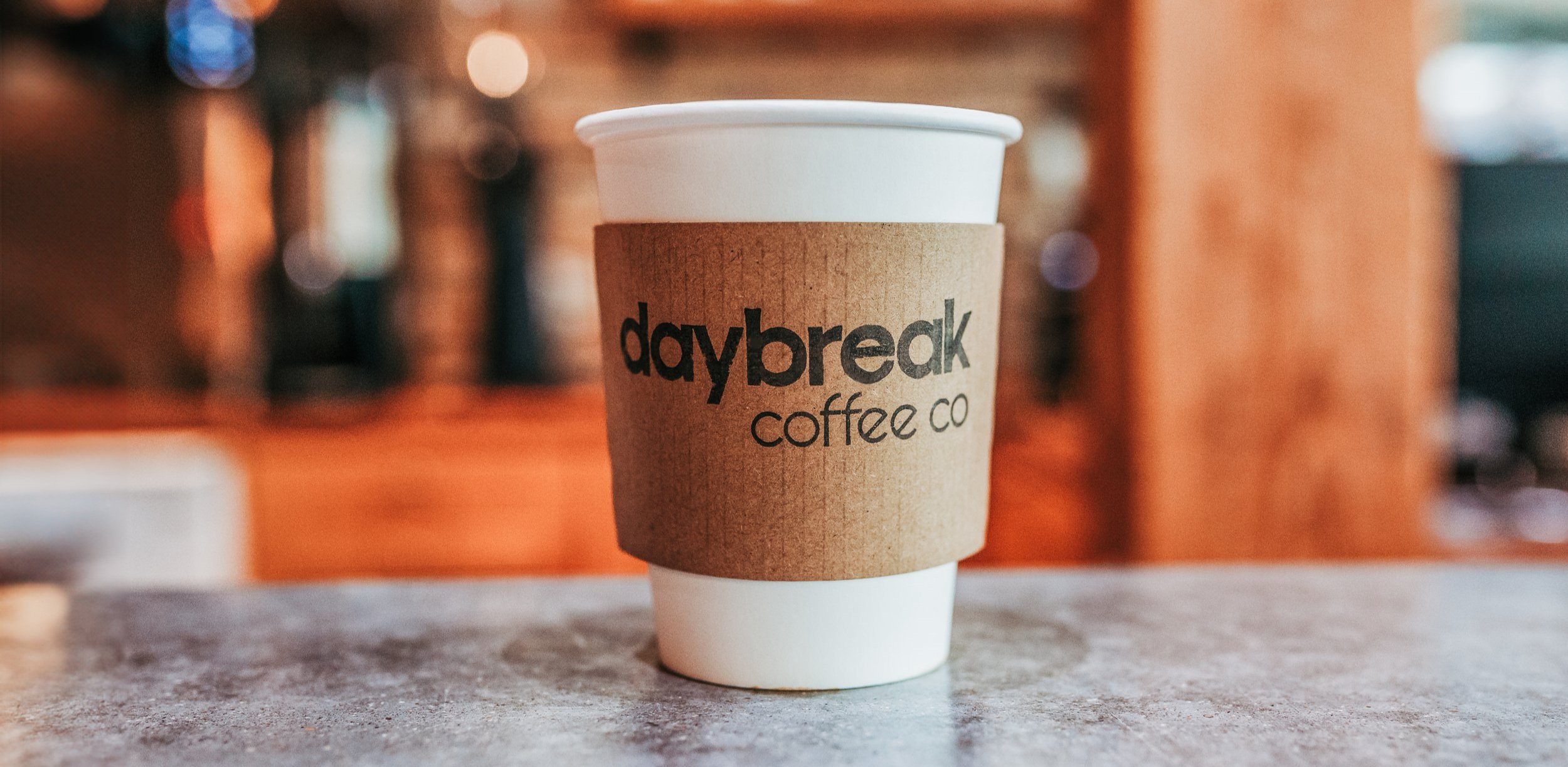
Primary Logo
The Daybreak Coffee Co logo should always appear in its full form. Use the primary logo whenever possible, ensuring high visibility and clarity.
Clear Space
Maintain a minimum clear space around the logo equal to the height of the letter “D” in “Daybreak.” This ensures legibility and prevents clutter.
Logo Variations
Primary: Full-color logo using Dire Wolf and Cyber Yellow.
Monochrome: Black or white versions for single-color applications.
Inverted: Cyber Yellow on a Dire Wolf background.
Incorrect Usage
Do not distort, stretch, or rotate the logo.
Do not add drop shadows or other effects.
Do not place the logo on busy backgrounds that reduce legibility.
Do not change the color of any logo elements outside of the brand palette.

COLOR PALETTE

Primary Colors
Dire Wolf (Pantone #282828)
RGB: 40, 40, 40
CMYK: 0, 0, 0, 84
Use: Main background, typography, logo elements
Cyber Yellow (Pantone #FFD400)
RGB: 255, 212, 0
CMYK: 1, 15, 99, 0
Use: Accent color, highlights, buttons, promotional materials
Secondary Colors
Dark Brown (Complementary to Dire Wolf)
RGB: 85, 68, 54
CMYK: 53, 61, 71, 46
Use: Photography overlays, video elements, subtle backgrounds
Light Brown (Warm, earthy tone)
RGB: 181, 136, 99
CMYK: 28, 46, 66, 5
Use: Background elements, photography tones
Leaf Green (Natural, accent color)
RGB: 34, 97, 52
CMYK: 65, 0, 46, 62
Use: Natural elements, social graphics, environmental references
Color Considerations
Favor Dire Wolf over black as it is has a warmer quality
Use Cyber Yellow when you want to add energy
Use Leaf Green sparingly, for a natural vibe
TYPOGRAPHY
Primary Font (Brand Name & Headings)
Custom-designed for Daybreak Coffee Co.
Secondary Font (Body Text & General Use)
Usage Rules
Use uppercase sparingly for clarity.
Maintain ample line spacing for readability.
Avoid using more than two font weights in a single design.
Do not add a period to Daybreak Coffee Co unless it is the end of a sentence like Daybreak Coffee Co.
Do not spell out “company” when using the name.
Do spell out “company” if it is a description like this, our new coffee company.
YES: Daybreak Coffee Co
NO: Daybreak Coffee Co. or Daybreak Coffee Company

VISUAL ELEMENTS
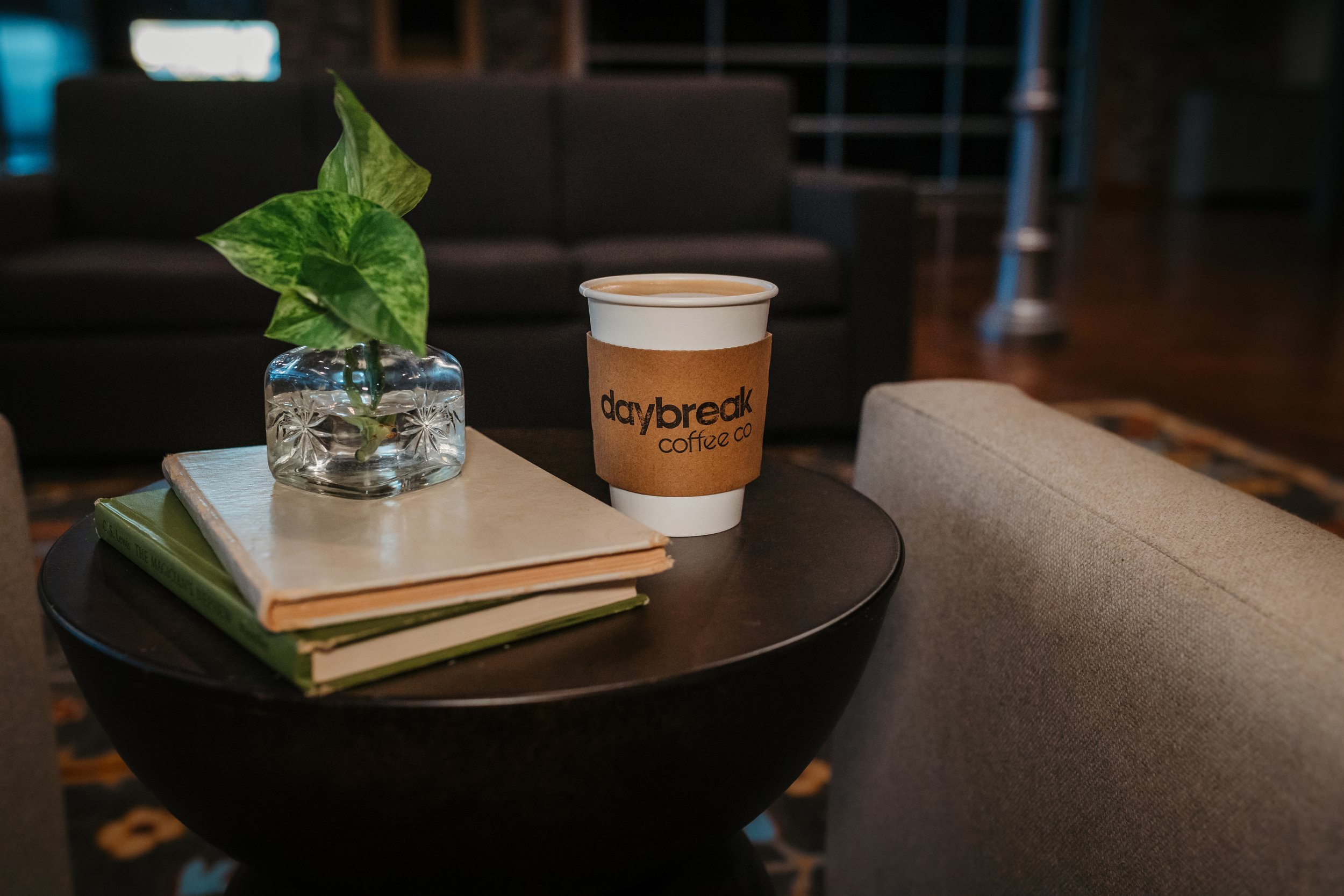
Textures & Materials
Natural Wood: Tables, accents, and decor
Greenery: Plants, warm environmental elements
Metal & Glass: Industrial modern touches
Soft Lighting: Warm, inviting ambiance
Photography Guidelines
Use natural lighting whenever possible.
Include human interaction to emphasize community.
Incorporate textures like wood and coffee grains.
Keep color grading warm and slightly desaturated for an elevated look.

SIGNAGE & DECOR
Signage should be clean, minimal, and modern, with natural wood and metal elements to enhance warmth.
Menus should be easy to read, using Visby Regular with Cyber Yellow highlights.
Interior Design should balance modern minimalism with warm, cozy textures.


DIGITAL & SOCIAL MEDIA
Website & Social Graphics: Use a combination of Dire Wolf, Cyber Yellow, and Leaf Green.
Icons & Buttons: Always high-contrast for readability.
Tone of Voice: Friendly, welcoming, and community-driven without being overly casual.

BRAND USAGE DO’S & DON’TS
DO: Keep designs clean and elevated. Use ample white space for a refined feel. Pair Cyber Yellow with Dire Wolf for contrast. Maintain consistency across all platforms.
DON’T: Overcrowd designs with excessive elements. Alter logo colors or typography. Use bright neon or highly saturated colors outside the palette. Overuse effects like drop shadows or gradients.